Building a Brand Kit for a Growing Startup
Treat your brand kit like infrastructure, not a design project, to avoid costly fixes later.
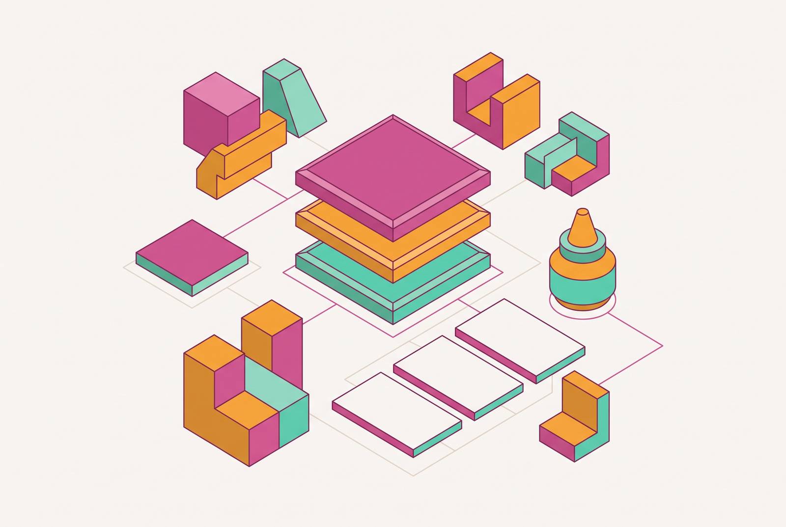
A brand kit is not a design deliverable. It's operational infrastructure, the same category as version control or a deploy pipeline, and treating it as anything less is why so many startups end up paying to fix the same problem twice. This piece walks through what a complete kit actually contains, the order you build it in, where AI genuinely speeds the work up, and how to keep the whole thing from rotting as headcount grows.
Most founders think a logo is the brand. It's one piece of a system, and teams that stop at the logo tend to spend several times more, later, cleaning up the mess a missing system left behind. Edelman's research puts a number on why consistency matters at all: 81% of customers say trusting a brand is a deciding factor in whether they buy from it, and trust builds only when a company earns it through consistent action. It shows up because the same colors, the same voice, and the same visual logic appear everywhere a customer runs into the brand. Shipping a product without version control would be reckless. Going to market without a brand kit is the same kind of reckless, just slower to notice.
The cost and time that used to make a real brand kit impractical for a five-person company have mostly gone away. That shift is why this should happen early instead of "eventually.""
The difference between a brand kit, a style guide, and a brand book, and which one a startup needs
These three terms get used like synonyms. They're not, and mixing them up leads teams to either overbuild or underbuild at exactly the wrong moment.
A brand kit is the asset collection itself: logos, colors, type, voice basics, templates, and the usage rules that hold them together. A style guide sits a layer above that. It adds tone of voice, messaging guidelines, company values, and context for when to use what, going beyond the purely visual. A brand book is the full reference document, the kind that makes sense for a company running multiple product lines, several regional teams, or a portfolio of sub-brands that all need to look related without looking identical.
Commissioning a full brand book at pre-seed is a waste of money. There's no team yet that needs that level of governance, and paying an agency for a lengthy binder of rules nobody will read is money that should've gone into product or hiring. A one-page style guide trying to hold together a 30-person team, across three time zones, hiring contractors every month, fails around Series A. It breaks almost immediately.
Most growing startups need a brand kit. Not a book, not a memo. It's complete enough to govern anything customer-facing, and light enough that a small team can build it in weeks and adjust it without a committee. The signal that it's time to graduate to a style guide is practical, not calendar-based: when new hires, freelancers, or partners keep turning in work that's technically fine but visibly off, the kit has outgrown itself.
What a complete brand kit contains
Each of these is a real deliverable on its own, not a box to check off on a template someone downloaded.
Logo and variations covers a primary logo, a secondary version, an icon-only mark, and a monochrome version, plus rules for minimum size, clear space, and what's off-limits (stretching, recoloring, dropping it on a busy photo). Consumer research consistently shows that research consistently shows that a large majority of consumers form an opinion of a company based on how its logo looks. Variations exist because a favicon, a conference banner, and a hoodie print all demand a different shape of the same idea.
Color palette: primary, secondary, and accent colors, specified in hex, and in RGB or CMYK if anything gets printed. Rules for which color sits on which background, and which combinations are banned. Color isn't decoration: it plays into a large share of a shopper's purchase decision, which means picking colors is closer to a conversion decision than an aesthetic one. Three to five core colors is a workable ceiling. More than that, and consistency starts slipping the moment a second designer touches the system.
Typography: a heading font and a body font, with size, weight, and spacing locked down. A typeface is the family (say, a geometric sans), while a font is the specific weight and size instance of it. Both need documenting, along with a hierarchy: which font shows up where, at what size, against what background color.
Brand voice and messaging covers tone words, a tagline, an elevator pitch, and the handful of messaging pillars the company keeps coming back to. The part that actually proves the voice works is sample copy, real sentences written in that voice, not a list of adjectives like "friendly" and "bold" that mean nothing without an example attached. This is the piece most teams skip, and skipping it produces a brand that looks consistent and sounds like five different people wrote it.
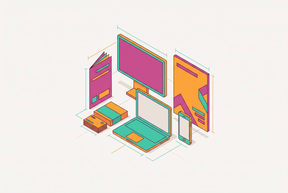
Business collateral templates: business cards, email signatures, letterhead, slide decks, social post layouts. Templates are what make the kit usable by someone who isn't a designer. Without them, the kit is a document people read once and forget. With them, it's a tool people open every week.
Brand guidelines document: the rulebook tying everything above together, with visual examples of what's allowed and what isn't. If the brand leans on illustration or custom icons, that visual style needs its own mini-guide too, so a freelancer three months from now can match it without guessing.
These pieces aren't independent. A gorgeous color palette with no type rules still produces sloppy, inconsistent output, because color alone can't carry a whole visual system on its back.
How to build the brand kit: the sequence that prevents rework
Skipping ahead in the order is the single most common way this work gets redone.
Start before opening any design software. Define values, mission, vision, and who the audience actually is. These aren't fluffy add-ons, they constrain every visual choice that comes after. Look at competitors' visual identities before locking in your own; differentiation is a strategic call made with eyes open, not a gut call made in a design tool. Write the brand story into the kit's opening section, so a contractor picking this up cold understands, in two minutes, what the company is and who it's for.
From there, the sequence:
- Define logo iterations and where each one gets used, before finalizing any single version.
- Lock the color palette with full technical values, hex and RGB and CMYK, not just a swatch that looks nice on a screen.
- Set typeface, size, weight, spacing, and layout rules across both digital and print.
- Define supporting visuals, icon style, illustration direction, photography direction, anything a contractor would need to stay on-model.
- Build the collateral templates that make the whole kit usable by non-designers.
- Write the guidelines document governing everything above.
Teams that design the logo before deciding on color psychology end up redoing the logo. Teams that build templates before nailing down type hierarchy end up rebuilding every template. Each step boxes in the next one, and that's the point.
Where AI fits into the brand kit build, and where it does not
AI speeds up execution inside a system a human already decided on. It doesn't replace the strategic groundwork, the brand story, the audience definition, the values work, that has to happen first regardless of what tools show up later.
Where it earns its keep: pressure-testing a brief through conversation before opening a design tool at all, a practice that turns hours of solo staring-at-a-wall into a structured back-and-forth. It's also useful for exploring visual directions fast before committing, drafting rough voice samples and tagline options for a human to sharpen, and spinning up template variations across different collateral formats.
AI rarely nails it on the first try. Three to five rounds of refinement per direction is normal, and treating the first output as final is the most common way teams end up with a brand kit that looks generated instead of designed.
On tools: Adobe's Firefly Image Model 5, announced at Adobe MAX 2025, generates photorealistic images at native 4-megapixel resolution and handles plain-language editing prompts. It now also hosts partner models from ElevenLabs, Google, Luma AI, OpenAI, Runway, and Topaz Labs inside one app. ChatGPT holds up best for complex, multi-part prompts and iterative back-and-forth, useful when brainstorming and visual exploration are happening in the same window. Midjourney leads on pure aesthetics for anyone chasing a highly stylized look.
Under current US Copyright Office guidance, output that's purely AI-generated gets weak or no copyright protection. Under current US Copyright Office guidance, output that's purely AI-generated gets weak or no copyright protection. Work where a person made real creative choices in the process may carry stronger protection than purely generated output. Documenting the creative process is therefore worth building into any AI-assisted workflow.
Parallel HQ's peer-reviewed study found organizations that brought AI into their design systems saw a 62% drop in design inconsistencies and a 78% jump in workflow efficiency. Real numbers, but they belong to teams running AI inside a governed system, not teams using it as a replacement for one. The practical middle ground is AI-powered platforms that output fully editable files rather than a static image format, because a brand kit's templates need to be editable by someone without design training, and a flat image file can't do that.
Turning the brand kit into a living system non-designers can use
A 47-page PDF sitting on a shared drive can't tell a contractor which logo file to grab. It can't stop an old, outdated version from going out the door, and it definitely can't update itself the next time the brand shifts even slightly. Static documentation was built for an era when one design team controlled every output. It was never built to govern a distributed team moving fast.
Three upgrades replace that PDF problem:
A digital brand hub holds live guidelines and approved assets at a single always-current location, which kills the version-control headache outright. A component-based design system, built inside a design tool, creates reusable pieces (button styles, header images, type treatments) that get applied the same way every time, without depending on one designer's memory of how things are supposed to look. A digital asset management system, Canto, which landed on G2's 2025 list of top-ranked DAM providers, is one example of this category, keeps every approved file searchable and current in one place.
Lemonly calls this "tokenizing" the design system: thinking like a developer and building reusable elements instead of one-off files. The goal is a system that survives a designer leaving the company, because nothing critical lived only in that person's head.
There's a clean test for whether any of this actually worked: can a salesperson, a marketer, or an ops person produce a correct, on-brand asset without pinging a designer first? If not, the kit is still a reference document, no matter how nice it looks. Salesforce, for one, built customizable, brand-approved templates so its social team could edit and post assets in a few clicks, no design queue involved. The lesson sitting inside that example: good template design is as much about what it locks down as what it leaves open for editing.
The payoff appears on the revenue line, not just the design-quality line. Research from Lucidpress, now Marq, found that consistent brand presentation can lift revenue by as much as 33%. That's not a small number for something that starts as a documentation problem.
Governance: how to keep the brand kit working as the team grows
Brand governance tends to break at the same few moments, over and over: a new region launches, a new department spins up, or a partner network gets brought on. Each of those adds people who had no hand in building the kit and no instinct yet for its rules.
Roughly 74% of people actively use some strategy to avoid advertising altogether. Which means brand consistency, built through governed assets that show up the same way everywhere, is a sturdier long-term advantage than campaign spend. Governance is a growth lever. It's a growth lever.
A simple onboarding sequence solves most of this before it becomes a problem. Every new hire, contractor, or partner should learn: what the brand stands for and what it explicitly doesn't, what they're allowed to change in a given template and what's locked, how to request a new template when nothing existing fits, and who to go to when something's unclear.
That last point needs an actual name attached to it. Designate a brand steward, a specific person, not a shared inbox that nobody checks, who owns the kit as a living document and updates it as the brand evolves. Permissions matter here too: not everyone needs edit access to master files. Most people just need locked templates with clearly defined editable zones, so someone can drop in new text without accidentally recoloring the logo.
Treat the kit as something that gets versioned and refreshed, never archived and quietly replaced, so the whole team is always pulling from the current state and not last year's PDF. There's an investor angle buried in here too: a startup that can show a governed brand kit is signaling operational maturity, not just design taste.
What a brand kit built early buys a startup over time
The mechanism compounds in both directions. Every asset produced from a governed kit reinforces the same brand recognition. Every asset produced without one adds to a pile of correction debt that only gets more expensive as headcount grows.
Speed is the most immediate payoff. Teams working from editable, on-brand templates produce a deck or a one-pager in minutes, not days, with no designer queue and no agency round-trip eating up a week. Eastern Peak, sourcing Edelman data, found that research finds that authenticity is a crucial factor for a large majority of customers who consider supporting a brand. A consistent kit is what turns that authenticity from something only the founder can express into something the whole team can express, correctly, without asking permission.
There's a talent and investor signal in this too. A clear, governed identity tells investors the company has thought past the product itself, toward how it actually shows up and competes for attention, and that reads as market readiness, not just good taste.
The real return becomes visible years out: a brand kit built at ten employees can still govern the company at fifty without a rebuild, because it was built to scale from day one. Skip that step, and the alternative is a corrective rebrand arriving at the exact moment the company has the least spare time and the most riding on getting it right.
None of this finishes when the guidelines document gets published. It finishes when anyone on the team, designer or not, can open a template, produce something correct, and ship it without asking a single person for help.