Design Templates for Sales and Marketing Teams
Templates let sales and marketing teams ship on-brand assets fast without designer bottlenecks.

Design Templates for Sales and Marketing Teams
Why GTM teams are the ones breaking under content demand
Design templates have quietly become the infrastructure that decides whether sales and marketing teams can produce consistent, professional visual assets at scale, or whether they stall out bottlenecked on designers or agencies. This piece looks at how that infrastructure works across the full range of assets GTM teams touch, and, more usefully, what separates a template that holds up under real sales pressure from one that quietly falls apart the first time someone needs it fast.
Demand for branded assets has grown faster than any design team's capacity to supply them, and no amount of hiring seems to close the gap, because the requests multiply faster than the headcount. Adobe found that 36% of marketers struggle just to find time for content creation, and that number is not about quality, it is about simply getting the thing made at all.
The bottleneck is not a staffing problem, even though it gets treated like one every budget cycle. Sales, marketing, and ops all need visual assets, and all three routes run through the same narrow design gate, a two-person internal team or a retained agency with a two-week turnaround. Widen the gate and the queue behind it just gets longer, because the requests were never rationed to begin with.
What breaks in practice looks the same at almost every company. The output goes out. It is off-brand, inconsistent with what marketing shipped last quarter, and it becomes the version of the company that particular prospect now has in their head.
That is the tell that this stopped being a design problem a while ago. It is an infrastructure problem, and infrastructure problems do not get solved with another tool bolted onto the pile. They get solved with a system.
The definition of a template system
For a lot of teams, "templates" often means a saved file, a shared deck, or a PDF someone emailed around, and these are not systems. A system implies governance, versioning, and a guarantee that whatever gets produced today looks like it belongs next to whatever got produced last year.
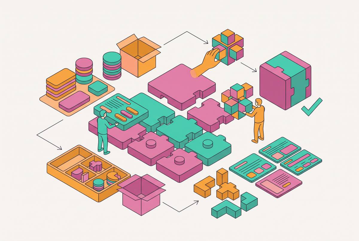
A real brand template system runs on three distinct layers, and skipping any one of them is where the whole thing quietly falls apart. First, there are locked brand elements, the logo, the font stack, and the color palette, all the things a non-designer should never be able to touch even by accident. Second, there are editable zones: copy fields, image swaps, data fields the rep or marketer actually controls without needing anyone's permission. Third, there is output flexibility, meaning the same underlying template can produce a slide, a social graphic, and a PDF without someone rebuilding it three separate times from scratch.
Brand templating, done properly, turns a repeatable asset into a governed template, and the word doing the heavy lifting there is governed. Plenty of things are reusable. A template folder full of old decks is technically reusable. What makes it a system is that the brand elements cannot drift, no matter how many hands touch the file. Take any one of those away and the system starts to strain.
There's a version of "template" that some platforms ship which is really just a locked, static export, and that is nearly as limiting as having no template at all. A PDF a rep cannot edit is not a tool, it is a wall with a nice color scheme. Genuine creative control within guardrails is the whole point: lock what must never change, and leave everything else open.
Why does any of this matter specifically for sales and marketing, as opposed to, say, product teams? Because reps and operators are not designers, and asking them to become one defeats the purpose of hiring them for something else entirely. The system's job is to make the correct, on-brand output the easiest possible output, so nobody has to choose between shipping on time and shipping something that looks right. What separates a template that holds brand standards from one that falls apart comes down to WYSIWYG editors for non-designers, dynamic fields for localization, and channel-appropriate output options.
The asset types GTM teams need covered
A real brand template system has three distinct layers, and not every asset carries the same urgency. Prioritize instead of trying to be comprehensive on day one.
The full stack a mature system eventually covers includes sales presentations and pitch decks, the most visible and highest-stakes asset type for AEs; one-pagers and executive briefs, the pre-meeting async assets, essentially a one-page PDF a rep can send before the call even starts; social content, meaning LinkedIn posts, ads, and announcement graphics for demand gen and personal brand; and static landing pages and microsites, increasingly necessary for SMBs and lean GTM teams that want a web presence without pulling an engineer off the roadmap.
Every asset type shares the same brand foundation, and each one gets optimized for a different channel, a different audience, and a different moment in the buyer's journey, which is what makes the underlying logic modular. A deck and a LinkedIn graphic should look like siblings, not strangers.
A gap shows up constantly. Plenty of teams have a perfectly good slide template and absolutely nothing for social or web, which means the top of the funnel, the exact place where a buyer forms a first impression, is often the least controlled part of the whole brand experience. The first thing a prospect sees is frequently the thing nobody templated. The full GTM asset stack that a mature template system covers spans the asset types GTM teams actually need covered.
How presentation templates work when they are built for sales, not designers
Deck design sounds like an aesthetic decision until the numbers around buyer behavior appear in the research. Whitepage Studio's cited research found that buyers complete up to 67% of their decision-making before the first meeting even happens, which means the deck a rep presents is not educating a blank slate, it is validating a conclusion the buyer already reached whitepage.studio. That reframes the entire exercise.
It gets worse if the materials contradict each other. Apollo's research found that 69% of buyers report contradictions between what they read on a vendor's website and what a seller then tells them in the room apollo.io. That is exactly the kind of thing a governed template system is built to prevent, since the deck and the website are drawing from the same locked brand layer instead of two different people's memory of the messaging.
A well-built sales deck template enforces a structure by default, whether or not the rep dragging content into it thinks about narrative arcs at all. That structure typically runs through a personalization slide (prospect name, logo, the specific reason for the conversation), a buyer problem slide naming the pain, a cost-of-inaction slide quantifying what the status quo is costing in time or money or risk, a desired-outcome slide painting the future state, a solution overview framed around outcomes rather than a feature dump, a proof slide with a comparable customer's measurable results, and a close built around ROI or a clear next step https://www.cflowapps.com/ai-workflow-automation-trends/.
Volume is not the goal here, and more slides is not a synonym for more thorough. Guy Kawasaki's old 10/20/30 rule, roughly 10 slides, 20 minutes, nothing smaller than 30-point font, still holds up decades later, and a good template enforces those constraints structurally rather than relying on the rep's self-discipline.
There's a reason visual-first layouts keep winning arguments in template design meetings: 65% of people learn best visually, which turns a clean, image-forward layout from a nice-to-have into something closer to a conversion lever. A good slide template forces one idea per slide, limits text by design rather than by willpower, and embeds the narrative arc so the rep is not reconstructing the whole story from scratch every single time they open the file.
Scale that logic up and decks stop being single files and start looking like component libraries, made up of an executive brief template, a core narrative template, and a follow-up one-pager template, each shaped for a different moment but drawing from the same brand layer. That is the modular AE workflow in practice, and it is a genuinely different mental model from "the deck," singular, that most teams still think in. Whitepage Studio finds that a deck of roughly 10–15 slides with a clear narrative outperforms a detailed 30-slide one, showing that structure drives results more than volume does.
Social and one-pager templates: the assets teams skip
Ask which assets get created most often by people who are not designers, and the answer is not the deck. Marq's enterprise usage data shows the assets created most often by non-designers are social graphics and flyers, and those happen to be the least governed assets in most companies' libraries. Insufficient governance over high-volume assets like social graphics and flyers is what lets brand drift into those materials.
Content volume is rising fast and creating real risk. A single campaign might need a couple dozen social variants across platforms, audiences, and formats, and without a template, every one of those is a fresh brand risk created from whatever the marketer had open in another tab.
Social templates carry demands a slide template was never built for. They need platform-specific dimensions and safe zones so a LinkedIn post does not get cropped into oblivion on a display ad, dynamic text fields so campaign copy can update without anyone touching the layout underneath, and image swap zones that hold the composition steady no matter which photo drops in.
Then there's the one-pager, arguably the most under-templated asset in most sales orgs relative to how often it actually decides something. The executive brief or leave-behind is frequently the only artifact a champion forwards internally to decision-makers who were never in the room for the pitch. It has to hold the brand line entirely on its own, with no rep there to explain the context or smooth over an awkward layout. Apollo's own modular framework for account executives treats the Executive Brief explicitly as a one-page PDF built for pre-meeting sharing and async review, and it belongs in every sales team's template library right next to the deck, not filed under "someday".
The practical implication is straightforward: social and one-pager templates should be the second priority in any buildout, right after the core deck, not an afterthought bolted on once the "real" design work is finished. Treating them as an afterthought is exactly how they end up ungoverned in the first place.
Where AI fits into the template workflow
The architecture of how AI operates inside these systems changed. It used to be single-step assistance, autocomplete-style suggestions layered on top of a manual process. Now AI tools run multi-step workflows without much hand-holding: drafting copy, swapping imagery, populating data fields, one step feeding directly into the next.
Inside a template system specifically, AI earns its keep in a handful of concrete spots. It populates personalization fields at scale, dropping in company name and industry context and buyer-specific pain points without a rep typing each one out by hand. It generates copy variants fast enough to actually A/B test social and email templates instead of guessing. It resizes and reformats a single design across multiple outputs automatically. And it assembles proposal content by pulling straight from data the CRM already has sitting there, which saves someone from retyping information that already exists somewhere.
What AI should not touch is a shorter and more important list. The brand governance layer stays put: AI-generated outputs still have to land inside locked template structures, not bypass them. Human review stays in the loop before anything reaches a prospect or a customer, because AI works best as a drafting assistant and considerably worse as an autonomous sender with nobody checking its work. And the strategic narrative, the actual choice of what to emphasize and what story a deck is telling, remains a human call. AI can fill in a slide. It cannot decide the story arc or the choice of what to emphasize, since those remain human decisions.
One requirement threads through all of it: AI-generated design only earns its keep if the result is genuinely editable afterward. A static image or a locked export hands the team nothing to correct, personalize, or update later, which defeats the entire premise of building a template system in the first place. Fast and wrong is not an improvement over slow and right, it is just a different flavor of broken.
What to look for in a platform when choosing where to build your template system
Picking a platform is not really an aesthetic decision dressed up as a business one. It is an operational decision, and the right answer is whichever platform's constraints actually match the team's workflow, skill level, and brand governance needs, not whichever demo looked slickest in the sales call.
A short checklist covers most of what matters: lockable brand elements so logos, fonts, and colors cannot be overwritten by someone who did not mean to break anything; WYSIWYG editing so producing good output does not require professional design software expertise; dynamic fields for personalization and localization at scale; multi-format output so one template renders across slides, social, PDF, and web without a rebuild each time; and real canvas editing, where every element stays individually movable and adjustable after the fact rather than getting baked into a static export.
A few platforms map onto that checklist in genuinely different ways, and each deserves to be weighed on its own merits. Figma Buzz is a template-driven asset creation environment built for marketers and non-designers specifically, where designers construct flexible templates upstream and the marketing team edits downstream without any real risk of breaking the underlying design system; it is the middle ground between tools that are easy but limited and tools that are powerful but require real training, and it is a strong fit where design systems and cross-team brand governance actually matter. Marq, formerly known as Lucidpress, built its whole identity around lockable brand elements: the brand team locks the logo, fonts, and colors, and everyone downstream produces collateral that stays on-brand more or less automatically, which suits distributed teams operating at real scale. Bynder sits further toward the enterprise end of the spectrum, an AI-powered digital asset management platform built for storing, organizing, governing, finding, and distributing brand content across a large library, more focused on governance of what already exists than on front-line template creation itself.
None of this is a decision to make lightly, either, given where the category is headed. Whatever platform gets chosen now is likely to define what the team is capable of producing well past the point where that growth curve levels off. Precedence Research, 2024, as cited in Figma's resource library, forecasts the generative AI design sector will grow from $741 million to $13.9 billion (roughly 18x) within a decade, and platform choices made now will define team capability through that expansion.
How to build and roll out a template system that the team uses
Most template initiatives do not fail because the templates themselves are ugly or poorly built. They fail because the rollout assumes adoption will just happen, the way a new coffee machine gets used without anyone sending a memo about it. Templates are not coffee machines. Nobody stumbles into using a brand system correctly by accident.
Getting the sequence right delivers more value than trying to cover everything at once. Phase one covers the core sales deck template and the executive brief one-pager, the assets every account executive uses every week. Phase two brings in social graphics templates for the LinkedIn post, the event announcement, and the ad variants that marketing needs constantly and currently builds from nothing each time. Phase three fills out proposals, case study shells, and whatever collateral formats remain. Phase four, for teams that need it, covers web or microsite templates for a lightweight digital presence.
A designer's role in a system like this is to build it once, not to sit in the approval chain for every single asset that ever gets produced from it.
Before any of it launches, a few governance calls need actual answers, not vague intentions. Which elements are locked, and who holds the key to unlock them if the brand ever needs to evolve? What does the approval path look like for a genuinely new asset type that does not fit the existing templates yet? Answer those before rollout, not during the first fire drill, because that is usually the moment the whole system either proves its worth or reveals it was never really finished in the first place.