Creating Multiple Asset Formats From One Brand Design
How to build reusable design systems that scale across every format simultaneously.
What "brand as a system" means
A single product launch today needs social posts, a slide deck, a one-pager, a landing page, and a stack of ad variations, all at once. Not on a schedule that lets a designer build each one in sequence, one after another, the old way. Flatline Agency's analysis found the slowdown in design work no longer happens at the creative stage. It happens in production, where campaign cycles have gotten shorter and asset counts have climbed fast. AI made it trivial to generate any single asset in seconds, so that part of the job is basically solved. What's left is the hard part: keeping every one of those outputs consistent and editable across formats, so a launch doesn't turn into forty disconnected files that all sort of look like the same company made them.
Three terms get used like they mean the same thing, which is a mistake. Brand guidelines are the rulebook: colors, fonts, voice, usage restrictions. Brand templates are governed, rule-based assets where a brand owner decides what can and can't change, and in 2026 that no longer means a PowerPoint file or a locked PDF sitting in a shared drive. A brand design system is the thing that connects those guidelines to every surface a company touches: websites, apps, social posts, video, AI-generated ads, email banners, landing pages. It also has to cover motion style, tone of voice, prompt rules for AI tools, design tokens, accessibility standards, and AI governance policy.
A template is one governed asset, but a system is what makes hundreds of templates agree with each other across totally different formats. Building fifty on-brand templates one at a time isn't the same job as building a system. Treating it like the same job causes launches to keep falling apart at the production stage instead of the creative one, which is exactly the failure this piece is about.
IBM's Carbon design system is the clearest real-world anchor here. Built to give brand cohesion across hundreds of digital experiences and teams scattered worldwide, it's an open-source system combining working code, design tools, human interface guidelines, and a community of contributors, all built on the IBM Design Language. The goal was never to centralize control in one design team. It was consistency without a bottleneck, a different goal entirely, and most companies still build for the first one by accident, then wonder why every request has to go through the same three people.
The 2026 wrinkle that changes the math: AI models increasingly train on brand-approved assets directly. Companies feed in tone guidelines, typography standards, past campaign creative, color palettes, and legal compliance rules, so the AI's output starts inside the brand instead of drifting outside it and needing correction later. A brand system is infrastructure now, built so people who aren't designers can produce work that's actually on-brand without filing a request and waiting on someone else's calendar.
Structuring the master source design so every format can be pulled from it
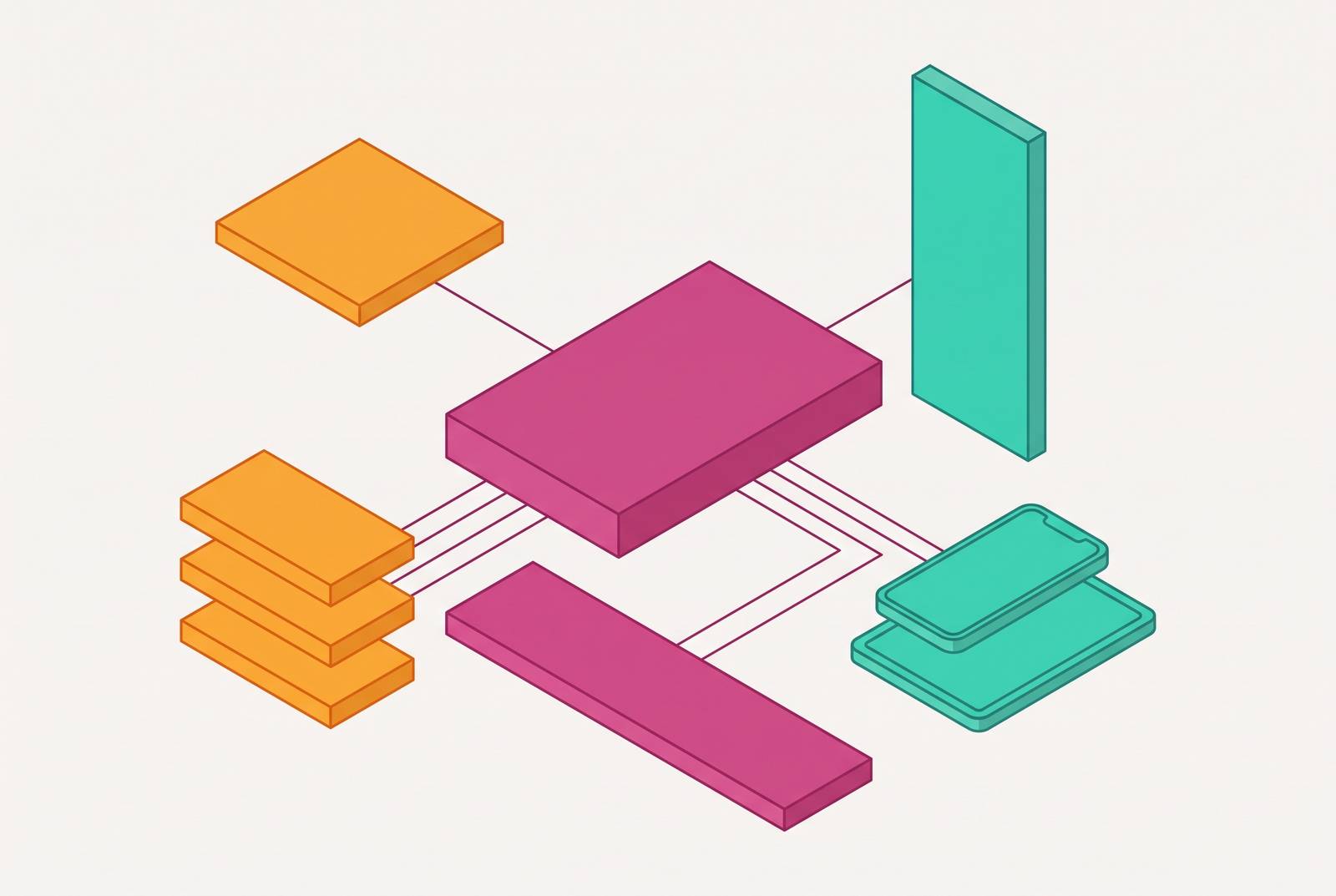
The master source design is a kit of modular parts, built to get recombined into whatever format a campaign needs next. A few pieces need to get defined once and reused everywhere without renegotiation:
- Color tokens use exact hex or RGB values that travel identically across every tool.
- The typography scale covers heading, subheading, body, and caption, sized to work at slide scale and at a cropped social-post scale.
- Logo and mark variants include full lockup, stacked, icon-only, and light and dark versions.
- Spacing and grid rules flex across 16:9 slides, 1:1 social squares, 9:16 vertical video, and letter or A4 print.
- Content modules include a headline block, a supporting text block, a stat block, an image block, and a CTA block, each one built to drop into any format without redesign.
Governance has to get decided before a single template gets built, not after, and skipping this step is the single most common reason systems fall apart six months in. Template admins set what's locked and what's open, and they own the brand assets going forward. End users create inside whatever boundary the admins set. They shouldn't need permission for every file, just clarity on where the fence sits.
Editability is non-negotiable. A master design that only exports as a flattened image file can't be adapted. Every element has to stay a live, editable object, so a format change doesn't mean pulling a designer back in. That's the actual line between a design system and a one-time export job, and it's the line most "systems" fail on: they look complete until someone tries to change a headline in a file that's already been flattened to a static image.
The Anima blog's July 2026 coverage points to the collapse of the gap between design and implementation as the biggest shift underway, with teams moving from idea to working prototype far faster than before. A useful gut-check for whether a source design is genuinely modular: can any team member grab one content block and drop it into a brand-new format without breaking anything? If the answer is no, it's a nice-looking file that happens to have several pages. Nothing more than that.
Adapting the source design into slides and sales decks without starting over
Presentations stopped being disposable files somewhere along the way. Research on 2026 presentation practice shows design systems now standardizing layouts, fonts, colors, and components across every deck a company puts out, not just the flagship ones going to the board.
Three principles carry straight over from the source design into slide format. Clarity means one main idea per slide, readable at a glance. Hierarchy means the most important element is the first thing a viewer's eye lands on, which maps directly onto the content-block structure already built into the source design. Consistency means fonts, colors, spacing, and alignment behave the same way slide to slide, and the same way they behave in the one-pager or the social post pulled from that same source.
Sales decks and pitch decks pull from the identical brand system but say different things, and mixing up their jobs is a common mistake, maybe the most common one on this list. A sales deck exists to get a prospect to a specific next step, centered on their problem and the proof the product solves it. A pitch deck exists for investors or stakeholders, centered on market size, team, business model, and financial projections. Same visual system, different argument.
Plan for the vertical slide now, not later. The 9:16 format is increasingly important in 2026, largely because executives read decks on their phones, not projected on a wall in a conference room. Every component in the source design needs testing at mobile scale, or it fails the moment someone opens the deck on an iPhone during a commute.
Non-linear presenting is growing too: clickable menus that let a presenter jump straight to whatever section the audience wants to talk about, skipping the rest. That only works if every section stands alone as a brand-consistent module, which a properly modular source design sets up from the start.
AI-generated decks tend to feel generic and miss narrative nuance, and no amount of prompt-tweaking fixes that on its own. Use AI to draft layouts, propose structure, or summarize a pile of data, and it does that well. But the emotional hook and the actual call-to-action still need a human hand on them, full stop. The brand system handles consistency. Persuasion is still a judgment call nobody's automated yet. Keeping the slide count tight is the difference between a deck that stays focused and one that loses the room halfway through.
Pulling a one-pager and case study from the same source design
One-pagers and pitch decks share a brand system, but they ask the reader to do something completely different. A pitch deck tells a story across a sequence of slides. A one-pager has to land everything in a single scan, no page-turning required. The job is summarizing revenue highlights, value propositions, and key data points in a format someone can absorb in under a minute, so legibility beats everything else, including cleverness.
Metrics like revenue growth, CAC, and LTV need to show up visually digestible, and the stat block from the master source design is the exact component built for that job.
When a luxury brand has to sell a concept to retail partners without cheapening its premium feel, the brand system has to hold the signal steady while the format shifts. That tension is the whole trick.
A separate example from the same source: a 60-slide technical document, dense with data, got cut down to 19 pages, a clean narrative built for sovereign wealth funds and regional development banks across the MENA infrastructure market. The discipline behind that cut, one idea per section, is the same logic that makes a good one-pager work.
Case studies follow the same rule: numbers should carry the argument, not paragraphs of prose. nSure's AI fraud protection case study led with a 98% approval rate from its AI solution and let that figure do the talking instead of three paragraphs explaining why it mattered.
A short checklist for this format: the grid collapses from a multi-slide sequence down to a single page, but spacing rules don't change. Logo placement, color, and type come straight from the source design without modification. And every element on that page has to stay editable, because a locked PDF can't get updated the day a metric moves or a customer logo needs swapping out.
Converting the source design into social content without losing brand coherence
Social is where brand consistency breaks first, and it breaks fastest. High posting frequency, multiple platforms, multiple people on the team publishing independently, all at once. That's a recipe for drift unless the source design is doing real work behind the scenes, not just sitting in a folder nobody opens.
For B2B teams, LinkedIn is the priority channel, full stop, and treating it as an afterthought raises costs that are visible in the numbers fast. For B2B audiences, LinkedIn consistently ranks as the most important platform among marketers, which makes brand consistency there a revenue question. That makes brand consistency there a revenue question.
On LinkedIn, authentic engagement, video, and personal posts tend to outperform raw reach and corporate broadcasting in terms of visibility. Practically, that means the source design's components need to double as static graphics and as visual frames layered into video.
A single brand source needs to flex across several shapes at once: a 1:1 square for the main feed, 9:16 vertical for stories and mobile-first placements, a 1.91:1 landscape crop for link previews, and a text-forward graphic built from the headline and stat blocks already defined in the source design.
Scaling to that output is genuinely hard, and most teams underestimate it badly. Rocketium and Superside's data shows one Amazon team of 25 produces 250,000 assets a year. That kind of output only happens when a governed template system pulls from a locked brand source. It doesn't happen when someone sits down and designs each post from scratch, no matter how fast that person is at Figma.
Colgate transcreated assets across seven countries in under two days. Localization at that speed only works when the structure stays fixed and only the copy moves, which is the practical meaning of "editable" in a social context: swap the copy, swap the image, resize the format, and the brand layer never gets touched. A static export can't do any of that, and trying to force it just means someone rebuilds the post seven times by hand.
Publishing the source design as a web page without rebuilding it
The old gap was structural: design files lived in one tool, and the live website got rebuilt by a developer in a completely different one. Every handoff was a chance for the brand to drift a little further from the source, and most of them did.
That gap started closing in 2026. Figma Sites, launched at Config 2025, lets a designer publish a fully responsive website straight from the design file itself. The design file and the live page aren't two separate things translated back and forth anymore. They're the same artifact, which sounds small until the alternative is a developer's Tuesday afternoon lost to fixing a padding mismatch.
For smaller teams without engineering resources on tap, that matters a lot. A campaign landing page, a one-pager rebuilt as a web experience, or a simple company site can now come out of the exact same source design already powering the slide deck and the social posts.
The Anima blog's July 2026 coverage describes a design-aware workflow that lets a team start from a design system, generate an interactive web experience from it, edit layout and copy through a chat interface, and publish a live version for feedback before handing off to developers.
The brand argument here is structural. Because the web page comes from the same file with the same tokens, type, and color system as everything else, it's basically impossible for it to drift off-brand the way a page built separately from a guidelines PDF tends to. Not every team needs a full site out of this workflow. But every go-to-market team runs campaign landing pages, event pages, or microsites, and those pages need to match the slide deck and one-pager a prospect already saw two weeks earlier.
How AI fits into this workflow, and where it breaks down without editability
AI earns its place in this workflow in a few specific spots: generating layout options from a brief instead of a blank page, resizing components across aspect ratios automatically, running compliance and brand checks before anything hits an approval queue, and drafting copy variations for different audiences or languages. Industry reporting cited in this research shows a campaign that used to take three weeks can now close in five days, with AI handling variation, localization, and platform-specific formatting.
The Designer Fund's 2026 report, which surveyed more than 900 designers across over 60 countries, found 91% of designers now use AI weekly for design tasks, up from 54% the year before. How that use gets structured matters, so it doesn't quietly wreck the brand while everyone's celebrating the speed gain. It's how to structure that use so it doesn't quietly wreck the brand while everyone's celebrating the speed gain.
Generation without editability breaks fast, no matter how good the output looks on day one. A generated image that can't be edited can't get its headline updated when messaging shifts next week. A generated layout that only exports flat can't get resized into a new format when the campaign needs a vertical cut. Most generic AI output has no real tie to the brand system, so it passes a visual quality check on day one and fails the brand consistency test by day thirty, once someone downstream needs to change one word and finds out the file is a flattened image with no editable layers.
The 2026 standard is AI embedded inside governed templates, tools like Adobe Express and Figma Buzz among them, where the AI generates within brand constraints instead of floating outside them. That's the actual requirement for AI to be useful across a multi-format system rather than a liability someone has to clean up later. Per 123RF, brand recall improved by 15% in AI-assisted campaigns, with the important caveat that the number assumes the AI output was brand-consistent and governed to begin with, not generated in a vacuum and hoped into shape.
The governance layer that keeps every format consistent when the whole team is creating
None of the structure above holds if governance is an afterthought, and most teams skip it because it feels like paperwork instead of design work. A modular source design with locked color tokens and editable content blocks still needs someone deciding who can change what, and where the fence line sits between a template admin's control and an end user's freedom to create.
That layer keeps 25 people producing 250,000 assets a year on one brand instead of drifting into 25 slightly different versions of the same company by the end of the quarter. The system does the heavy lifting. Governance is what keeps it honest once the whole team starts pulling from it at the same time, which is exactly when things tend to go sideways without it.
Sources
- AI in Design 2026: Best Tools, Real Workflows, What's Next | Devlin Peck
- Graphic Design in 2026 - Anima Blog
- AI-Powered Asset Creation in 2026: Speed Without Sacrificing Brand Consistency
- AI design tools for brands: 5 tools shaping creative workflows in 2026
- Design Systems in 2026: How Brands Stay Consistent Across Web, App, Shorts, and AI Creatives
- Top 3 Benefits of Design Systems for Modern Brands in 2026
- rocketium.ai
- builder.io