Proposal Design for Enterprise Sales Teams
Proposals must persuade without the rep in the room, so design choices directly shape deal outcomes.
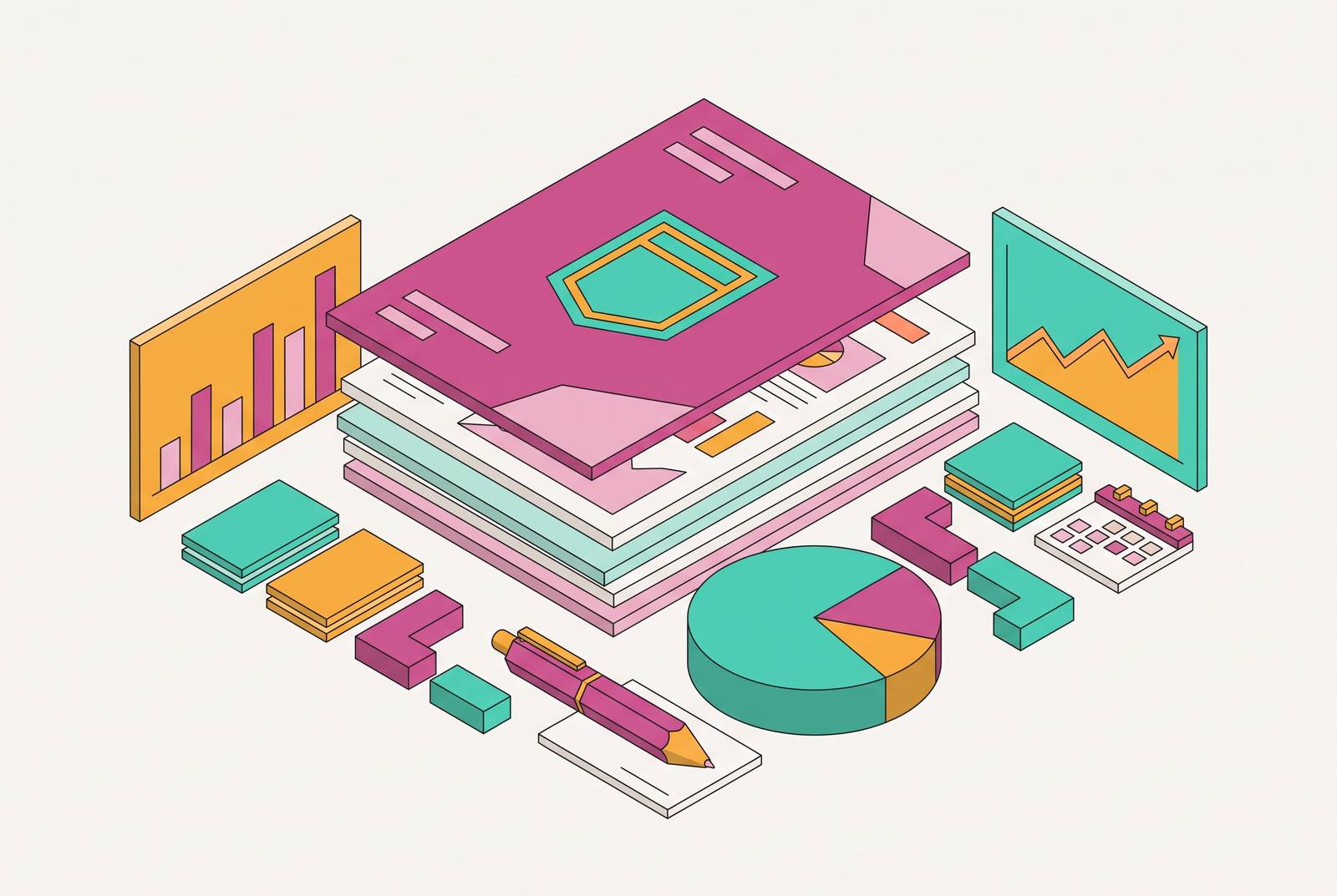
A proposal document lands in a shared inbox at 4:47 PM on a Thursday, and the rep who built it is nowhere near the room where it gets opened. That is the entire argument of this piece: proposal design is not a cosmetic layer applied after the real selling is done, it is a deal-stage asset that has to do persuasive work on its own, without a human there to translate it. The middle of the deal cycle, where proposals get assembled, RFPs get answered, and competitive positioning gets locked in, is where the gap between top-performing reps and everyone else actually costs money. A well-designed proposal is not decoration. It structures the business case, it guides a half-dozen different people toward the parts that matter to them, and it holds up when a CFO, a technical buyer, and a procurement lead each read it separately and compare notes later.
Enterprise buying has gotten structurally larger and slower, with bigger committees and longer review cycles spread across more people, and a document that once got narrated in a conference room now has to carry that narration itself. This section is the setup, not the full case. The sections that follow walk through how committees actually read these things, which design choices move the needle, and why the tooling behind the document matters as much as the writing inside it.
How the enterprise buying committee reads a proposal
Here is the mechanical reality nobody puts in the sales playbook: nobody on the buying committee reads a proposal start to finish, together, at the same time. Each is reading asynchronously, often forwarding a single page to a colleague with a one-line comment, and the document has to survive that fragmentation on its own.
A flat, uniform proposal, the kind that marches through fifteen pages in one sequence regardless of who opens it, serves none of these readers particularly well. The fix is structural: a core section that orients any reader regardless of role, followed by modular sections built for specific jobs, financial impact, technical architecture, implementation risk, legal and procurement terms, each one navigable without wading through the rest.
Enterprise deals generate a lot of moving parts. A proposal that anticipates this instead of reacting to it after the fact is doing its job. Visual hierarchy, meaning headers that actually label something useful, callout boxes that pull out a number worth remembering, and anchors that let a busy VP's eye land in the right place, exists to do real work. It tells that VP which two paragraphs were written with her in mind, and it does that without requiring her to read the other thirteen pages first.
The design choices that directly affect how a proposal is evaluated
Think about what a buyer actually does with a proposal in the first ninety seconds. Every design decision inside the document either survives that kind of handling or it doesn't.
Density is doing more signaling than most sales teams realize. A page with clear visual hierarchy and actual white space tells the same reader the opposite: that someone sat down and decided what the two or three things worth saying actually were. It is a credibility test, and most proposals fail it quietly, without anyone on the vendor's side ever finding out why the deal went cold.
Raw tables are part of the problem. A twelve-row table with the same four numbers buried in column six does not. This matters because the screenshot test from the paragraph above is unforgiving: a chart screenshots well, a dense table does not, and the version that travels further inside the buyer's organization is the one that wins the argument when the rep isn't in the room to explain it.
Typography and color consistency carry their own signal, and it has nothing to do with taste. Procurement teams evaluate vendors on operational maturity as much as on the product itself, and a proposal is one of the only operational artifacts they get to see before signing anything.
The cover page and the executive summary deserve more attention than most sales teams give them, because they are the only two pages every single stakeholder on the committee is guaranteed to open. If the CFO never gets past page one, page one has to carry the argument.
Brand consistency in proposals as an operational problem
Two reps on the same enterprise team send proposals to two different prospects in the same week. If both prospects ever compare notes, which they sometimes do, the company now looks like two different vendors wearing the same name tag.
Generative AI adoption for customer-facing content is widespread at this point, but the gap between teams using it well and teams that merely have access to a tool has gotten wider, not narrower. A procurement team that receives one of these reads it correctly, as a document assembled in a hurry with no real design process behind it, and files that impression away alongside every other data point it's collecting about whether this vendor can be trusted with a multi-year contract.
The fix is the same one manufacturing figured out a long time ago: build the component once, then let everyone pull from it. A cover page layout, an executive summary format, modular section templates, data visualization frames, all built once and locked down, give every rep on the team the same credibility floor before they've typed a single word about the specific account. They mean the account name, the specific pain points, the proposed scope, all stay editable, while the fonts, colors, and layout elements that actually carry the brand stay fixed. That's the whole point of a design system: freedom where it helps, discipline where it matters.
How AI-assisted proposal workflows close the gap between top reps and the rest of the team
The reps who consistently win enterprise deals are often just faster at producing something credible, and workflow-embedded AI is how that speed gets distributed across a whole team rather than staying locked inside two or three people's heads. A standalone assistant that a rep has to open in a separate tab, copy text out of, then paste somewhere else and reformat by hand, adds a step. AI embedded directly inside the proposal workflow, where the rep already is, lets people keep working as they already do, and the output lands already shaped for the next step.
None of this works if the AI starts cold. Feeding it buyer archetypes, specific pain-and-solution pairings, and messaging angles before asking for a draft is what separates an output that's technically correct from one that's actually right for this account at this stage of this deal. Skip that step and the AI produces something generically plausible, the kind of draft that sounds like it could apply to any prospect in the pipeline, which is precisely the off-brand, undifferentiated signal the previous section warned about.
The work itself breaks down into a few distinct jobs, not one undifferentiated blob called "AI writing the proposal." Generating role-specific sections, the CFO's financial-impact page, the technical buyer's integration rundown, procurement's risk summary, from a single content brief is a third job entirely, and it's the one that most directly answers the challenge of writing for multiple stakeholders at once, raised two sections back.
None of this removes the need for a human to check the math. An incorrect ROI figure or an overstated product claim in an enterprise proposal doesn't just look bad, it burns real time and can sink a deal that was otherwise winning. AI handles the assembly. A person still has to validate every number and every claim before the document leaves the building, full stop, because the AI has no way of knowing which claims are still true for this specific account in this specific quarter.
The real payoff appears when the AI's draft lands on an editable canvas the rep can actually touch. The fact that every piece of it stays editable turns a generic first pass into a document personalized in minutes instead of hours, and that is the entire economic case for building AI into the workflow.
What to look for in a proposal design platform under enterprise scrutiny
A sales ops leader evaluating tools for this doesn't need a feature list. The criteria fall directly out of everything established so far: does the output serve multiple stakeholders at once, does it stay on-brand without a rep having to think about it, can a rep customize it fast, and does every element stay editable after the AI generates it.
That last one isn't negotiable. A platform that outputs a flattened image or a locked PDF leaves a rep stuck the moment a number needs to change, a timeline slips a week, or a logo needs swapping for a partner co-branded deal. If a human can't go in and fix a wrong figure, the whole validation step becomes theater, a direct failure of the guardrail from the section above.
Locked-template architecture matters for any team bigger than a handful of reps. A brand or design lead should be able to lock down fonts, colors, logo placement, and section structure at the platform level, while leaving the content fields, the account-specific details, open for whoever's building the proposal that week. The tension between consistency and customization gets resolved when proposals exist as genuinely editable assets on a real canvas, rather than as either rigid templates or static exports with no room to move. Platforms like Moda, which generate proposals as fully editable designs rather than flattened files, let reps apply brand guidelines and account-specific detail without needing design training, so a document can carry operational polish and still flex to the specifics that actually close a deal.
Canvas-based output beats document export for a practical reason: a design that lives as a real file, not a PDF baked from a template, can be updated, versioned, and reshaped for a different stakeholder audience without rebuilding from zero. A platform that compresses that gap from a few hours to a few minutes changes who inside the organization is capable of competing for the enterprise logos, not just the SMB ones.
The operational case for bringing proposal design in-house rather than routing through design or agencies
The objection comes up almost every time this gets discussed: don't polished proposals require an actual designer, or an agency with a proper creative process? The agency model and the enterprise sales calendar run on two different clocks, and they don't sync.
A proposal that needs to land in a CFO's inbox by Friday morning cannot wait on a creative brief that still needs sign-off from someone's manager on Monday. Enterprise deals move on the buyer's schedule, not the production calendar of an outside vendor, and a four-day turnaround on a proposal revision is a four-day head start handed to whichever competitor isn't waiting on anyone.
The staffing math points the same direction. Scaling brand consistency across a distributed sales team takes tooling that doesn't force a rep to trade speed for polish, and AI design platforms built specifically for sales workflows, ones where non-designers can turn out on-brand material in minutes rather than days, make that consistency the default outcome instead of a constant fire drill for whoever owns the brand.
That doesn't mean the design function disappears, it moves upstream. A design lead's real job becomes building the system once, setting the templates, locking the components that carry brand weight, approving what goes into the shared library, so that downstream, a rep can produce something on-brand without needing a designer's involvement on any individual deal. Every cycle a team closes faster and more credibly than a competitor still waiting on an agency queue widens a gap that compounds quarter over quarter. Waiting around while a competitor builds that in-house capability first is the risk.
Putting it together: a proposal design standard for enterprise sales teams
None of this is a style guide. A proposal design standard for enterprise sales is a set of structural and visual commitments that make sure every proposal, regardless of which rep built it, survives contact with a skeptical, multi-stakeholder reading.
Four layers hold the whole thing together. Structure means a core section any stakeholder can orient from, modular role-specific sections underneath it, and a cover plus executive summary that compress the full argument into the two pages everyone is guaranteed to open. Visual discipline means one claim per visual unit, data charted rather than tabled, white space treated as a credibility signal rather than wasted room, and typographic hierarchy that stays consistent from page one to page fifteen. Brand governance means design-system elements locked at the platform level, content fields left open for rep-level customization, and a component library broad enough to cover real proposal scenarios without anyone needing bespoke design work for a one-off deal. Workflow means AI-assisted first drafts built on real deal-stage context, human validation on every factual claim before anything ships, and a platform whose output stays fully editable.
Teams that treat proposal design this way, as a revenue workflow maintained deliberately rather than a formatting task handled ad hoc, end up closing more enterprise deals, closing them faster, and building a credibility advantage that compounds with every cycle. A generic, inconsistent proposal can't catch up to that once the gap opens.