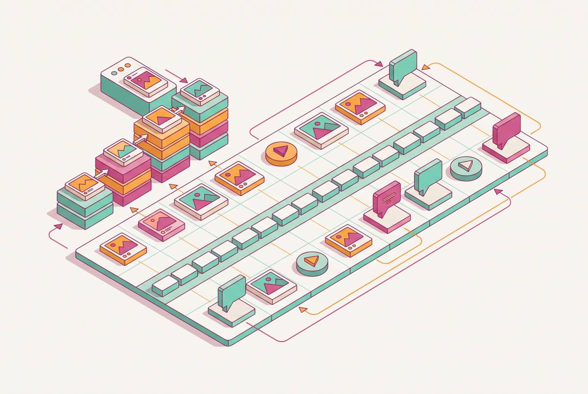
Repurposing Long-Form Content Into Social Visuals
A repeatable template system beats redesigning every social post from scratch.

Repurposing long-form content into social visuals works best as a repeatable production system, not a favor someone in marketing owes the team whenever a blog post goes live. And the team starts from zero: new fonts, a blank layout, copy rewritten from scratch, as if the blog post never happened and the carousel is its own invention rather than a derivative of something already done.
Teams treat visual content creation as a string of separate creative events instead of one operating system that runs on a schedule. The only thing that survives is the general topic, and even that gets reinterpreted by whoever happens to be building the derivative that week.
Brand drift follows naturally from that reset. None of this happens because anyone on the team is careless. It happens because there's no shared system telling them what "on brand" means beyond a logo file sitting in a shared drive somewhere.
The fix isn't generating more ideas. Everything that follows in this piece is an attempt to describe what that process actually looks like, stage by stage.
Ranking your backlog by what makes a long-form asset worth repurposing
Not every blog post or webinar deserves a second life as a carousel. Feeding weak source material into even a well-built system just produces weak derivatives faster, so the backlog needs a filter before it needs a workflow.
Three traits separate a worthwhile source asset from a dead end. A post reacting to last quarter's funding news is not.
Historical performance matters too, and it's a more reliable signal than gut instinct. One practical framing scores this loosely as reach times relevance times shelf life, giving a backlog of fifty posts a rough rank order.
Source richness separates the assets worth mining from the ones that'll only ever yield one post. A single-idea blog post, by contrast, usually yields exactly one derivative, because there's only one idea to extract.
Topical depth rounds out the list. An asset needs enough sub-points to support multiple distinct angles, so each derivative says something slightly different rather than repackaging the same sentence five times in five formats. Keep a running "repurpose candidates" list inside the content calendar, and tag anything that overperforms the moment it happens, before the context around why it worked gets lost.
How to extract the right visual units from a single long-form piece
Extraction is the step most teams skip entirely, which is exactly why they end up redesigning from scratch every time. It means pulling discrete, nameable visual units out of a long-form asset before any design software opens, and it's what separates an actual system from a pile of good intentions.
A single well-researched blog post, properly extracted, becomes more than one post's worth of material. One practical repurposing framework treats this as a baseline: a five-part carousel, a three-post thread, a quote graphic built around the single strongest line, and a section in the next email newsletter, all pulled from one source. That's four derivatives most teams leave sitting in the original document, unextracted, because nobody set aside the fifteen minutes to go looking for them.
Four categories of extractable unit matter most for visual work. Section headings themselves can get reframed as questions or provocations, becoming the hook text for a social post rather than staying buried as a header nobody scrolls past.
The habit that saves hours later: note timestamps or paragraph references during this review, before any editing starts, and do all of it in one sitting. Interleaving extraction with design work is where the hours disappear, because switching between "what's the idea here" and "what does this look like" burns more time than either task alone.
Nobody has time to audit every asset before designing anything, the objection goes. Fair, except skipping the audit is the exact habit that causes the Tuesday-morning scramble in the first place. A focused extraction block, done once per source asset, takes a short chunk of time and removes hours of rework later, because the design stage starts with units already chosen instead of starting with a blank page and a deadline.
The three visual formats that carry most repurposed B2B content
Once the units are extracted, the next decision is what to build with them, and for professional-channel content, three formats carry most of the weight: carousels, quote cards, and single-frame graphics. Each one does a distinct job, and knowing which job it does matters more than knowing how to design any of them well.
Carousels carry sequences and arguments. A step-by-step guide, a framework with four or five components, a full argument that needs more than one beat to land: all of these belong in carousel form, because the format rewards a reader willing to swipe through multiple slides in exchange for a complete idea.
Quote cards carry authority, and they travel further than almost anything else in the format lineup precisely because they ask nothing of the viewer. One strong line from a blog post or an interview, branded and set on its own, gets the point across in the time it takes to glance at a feed. A reader doesn't need context to understand a well-chosen quote card, which is exactly why it gets saved and shared more than a denser format would.
Single-frame graphics, things like data charts, checklists, and comparison frames, do the job of simplification. A numbered list or a key stat, dropped into a single visual frame, becomes something a scrolling reader can understand in under three seconds, which a paragraph of text rarely manages. These also double as supporting slides inside a carousel, so the format isn't limited to standalone use.
Matching source to format is close to mechanical once the categories are clear. Short-form video is a real option for some teams, but it sits outside the scope of a visual asset system built for non-video producers, so it stays out of this list on purpose.
Templates keep brand consistency intact when multiple people produce visual derivatives
Brand consistency breaks down at volume for structural reasons. Once more than one person is producing visual derivatives, the absence of a shared source of truth for design decisions becomes the whole problem.
The pattern is familiar to anyone who has scrolled through a brand's own feed and noticed the seams. Stacked across a month of posts, they add up to an audience seeing a company that looks slightly different every week, even when the underlying ideas are strong and consistent.
Templates are the structural answer. A locked brand template defines colors, typography, logo placement, and spacing once, up front, so the person producing a given week's content fills in copy and imagery without needing to make a single design decision from scratch. The governing idea in practice gets called "democratization with guardrails": designers build the system once, and everyone else operates inside it without needing design training of their own.
Ava Labs put this into practice directly. It produced a repeatable template system that let the team scale social activation without redesigning every asset from first principles each time a new post was needed. The output wasn't just "nicer graphics," it was a system that kept producing consistent graphics without additional design labor per post.
A team that feeds its strongest on-brand pieces into its design tooling as reference material reduces off-brand drift before it ever reaches production, because the system has something concrete to measure new work against. That's a meaningfully different posture than catching drift after the fact, in a review step, once the asset is already built and someone has to ask for revisions.
Platform adaptation: why the same content unit needs a different wrapper on each channel
A template system solves brand drift. It doesn't solve the next failure point, which appears at distribution: posting the same asset, unchanged, across every channel the team happens to be active on.
Platforms penalize sameness, and they penalize it on two fronts at once. The content itself might be strong. The wrapper around it is telling viewers it wasn't worth a second thought.
The resolving principle is variation within repetition: the core idea stays fixed, but the entry point changes every time it resurfaces. One repurposing framework states this directly. Repurposing keeps the core idea intact but rebuilds the structure, pacing, and tone for each channel it touches.
LinkedIn carries most of the weight for B2B teams working through this process, and its behavior follows specific patterns. The content mix matters too: problem and solution framing, social proof, and case studies carrying ROI numbers all convert better when paired with a visual that reinforces the claim.
A short adaptation checklist runs per derivative, not per campaign. And add a call to action that's native to where the post lives, not a generic "learn more" copied from the blog.
A repeatable weekly repurposing workflow for a small team
All of this collapses into a five-stage weekly rhythm that a small team can run in a single production session, start to finish, without reinventing the process each time.
Stage two is the extraction batch. No design work happens in this stage. That constraint is the point.
Stage three is design production. Open the branded templates built in the consistency stage and fill in the units pulled during extraction, producing every derivative for the week in one sitting rather than scattering the work across five separate days.
Batching discipline across all five stages removes the constant context-switching that makes repurposing feel expensive even when the total time invested is modest, since doing all extraction in one block, all design in one block, all scheduling in one block keeps that cost from creeping back in through any single stage.
How moving repurposing in-house changes the economics of content production
High-volume, high-frequency output, social calendars, template-driven adaptations, resizing one campaign across a dozen formats, is moving in-house because of proximity and speed. An internal team sitting next to the brand's own knowledge can turn a source asset into five derivatives in the time an external cycle would still be waiting on a first round of revisions.
That doesn't mean agencies have lost their role entirely. It means a specific category of task, the repeatable, template-driven, high-frequency kind, now makes more sense handled by someone who already knows the brand's voice without a briefing document. Someone internal still decides which assets deserve priority, which derivatives are worth publishing, and which ones need another pass before they go out.
The actual shift isn't about eliminating creative expertise from the process. A five-day turnaround on a carousel stops being acceptable once the team realizes the same carousel could exist by Thursday afternoon using a system that was sitting there unused.
How to measure whether the repurposing system is working
A system that runs without any measurement attached to it will optimize for how much it produces, not for whether any of it matters. Track signals that point toward business impact.
Saves and shares indicate content useful enough that someone wants to return to it later. Comment rate indicates the post started a conversation. Click-through back to the original long-form asset indicates the derivative pulled attention toward the source.
Tracing performance back to source matters as much as tracking the performance itself. When that carousel outperforms the rest of the week's posts, the signal is that the source asset behind it had unusually strong extractable material, and that asset belongs back at the top of the repurposing queue for a second or third derivative.
The review cadence matters too. One visual content framework recommends a system-level review, weekly rather than daily, assessing format performance in aggregate and adjusting template priorities or extraction categories based on patterns across several posts.
Two failure modes appear often enough in the data to name directly. Inconsistent performance within the same format, meanwhile, usually points to brand drift creeping back in, which means the templates need tighter constraints or the review step is happening too late in the cycle to catch it.
None of this is a one-time tune-up. Each measurement cycle narrows down which source formats, which extraction categories, and which visual formats actually produce returns worth repeating. A few months into running the system this way, a team isn't guessing anymore about what to repurpose or how to build it. The data from the last dozen cycles has already answered both questions, and each week's output gets a little sharper than the one before it.